
Verizon Full Transparency & News Center Redesign
Vision
Conceive the Verizon News Center of the future and help elevate the company’s perception as one of the world’s top-performing technology brands.
Asks / Objectives:
Build a News Center site that reflects their commitment to innovation, trustworthy reporting, and the ever-evolving nature of their business
Create an innovative tool that highlights their position as a leader within the trust and innovation space
Improve UX to make wayfinding easier for both high volume (employees, customers, job seekers) and high value (journalists, shareholders) stakeholders
Create a streamlined design system to highlight news and build an audience base, without introducing new internal governance protocols
PART 1: Product Innovation
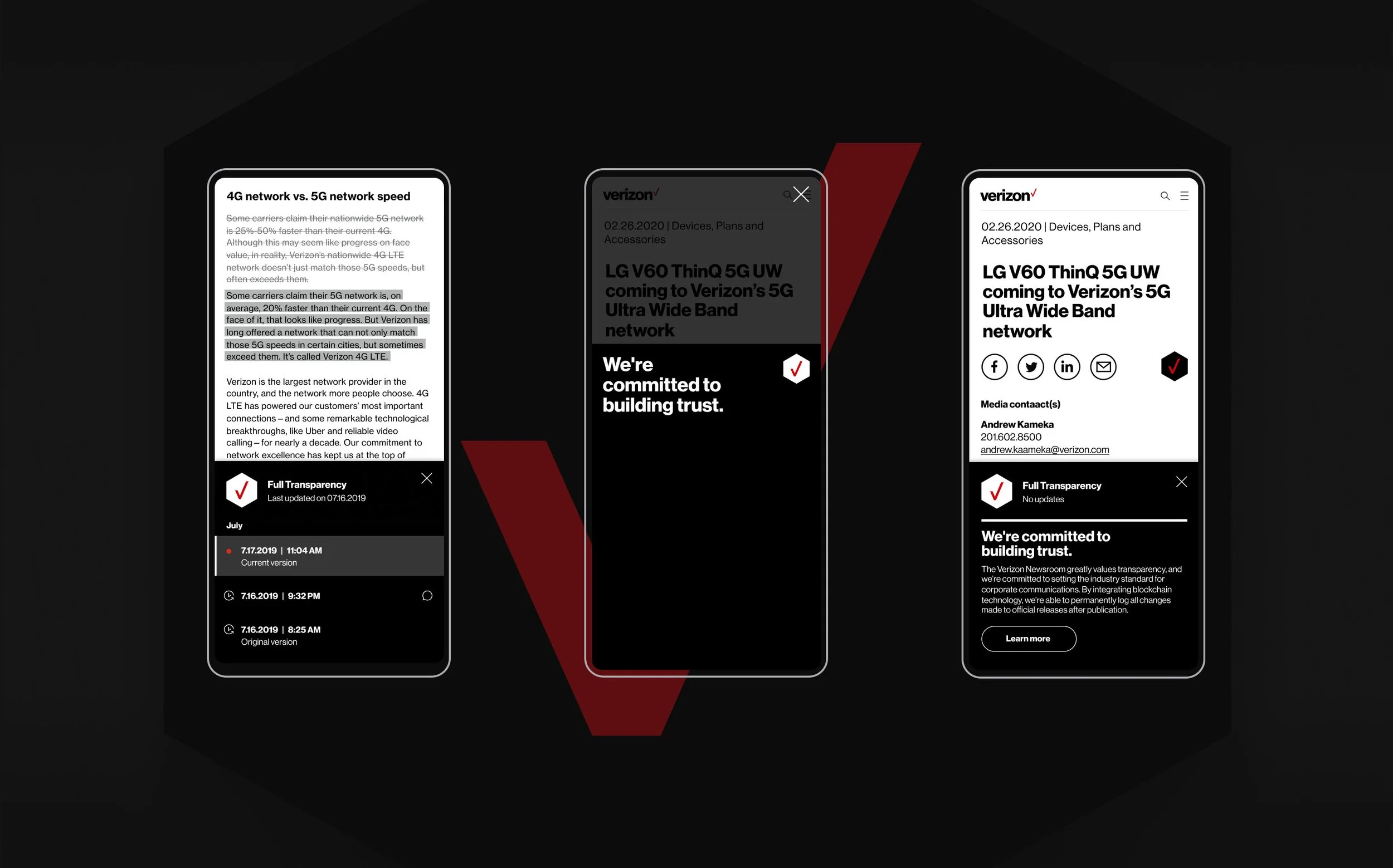
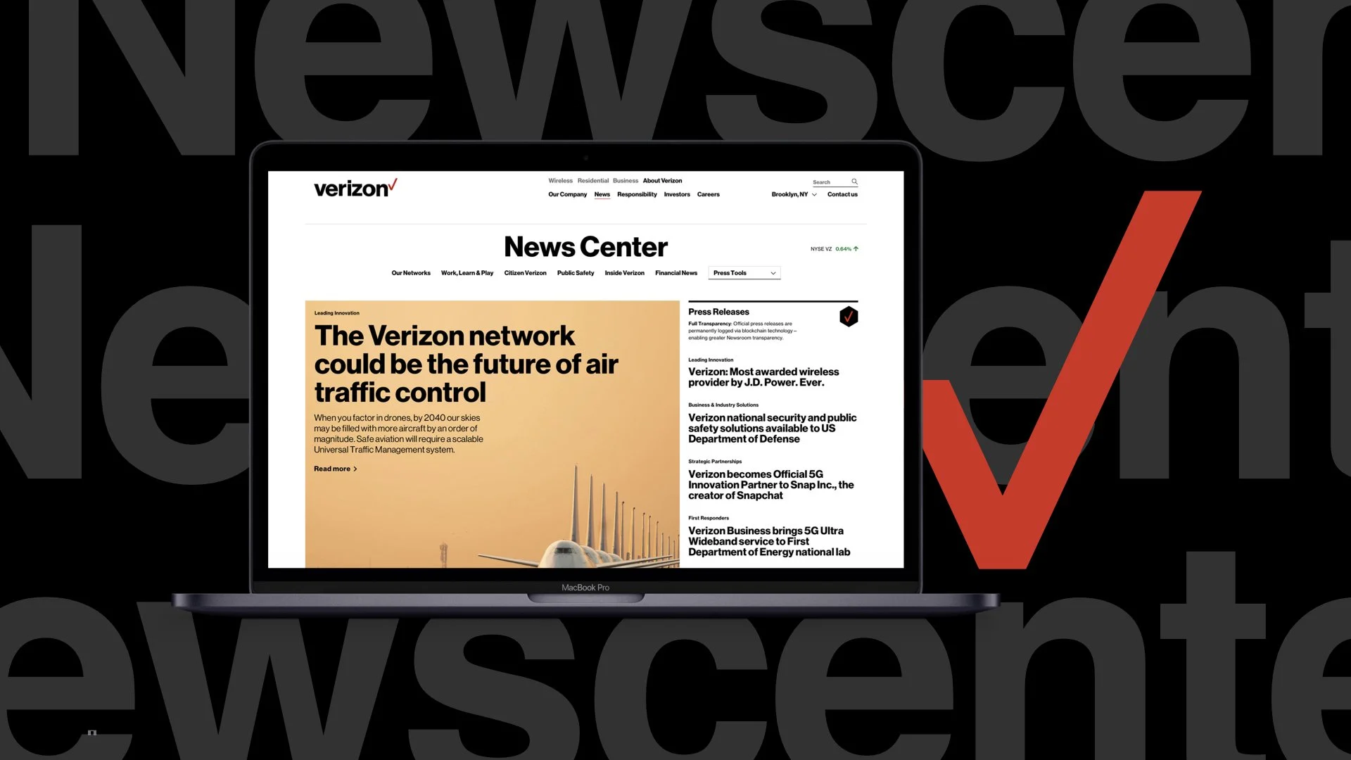
Full Transparency
The editorial tool reinforces Verizon’s commitment to transparency while fundamentally changing the way visitors engage with a newsroom. All official news releases on the site are permanently logged via blockchain technology and text-based edits are visually tracked.
Watch the case study here :
UI
All text changes made to official news releases—from minor linguistic edits to statistical updates are documented. All details are timestamped, making them easily verifiable. The UI allows users to view changelogs by version history.
Landing Page
The “Learn more” CTA drives to the landing page that includes details of the tool’s purpose, application, advantages, and vision for the future. The following video illustrates how the team had initially envisioned it. You can find the live version here.
PART 2: Verizon News Center Redesign
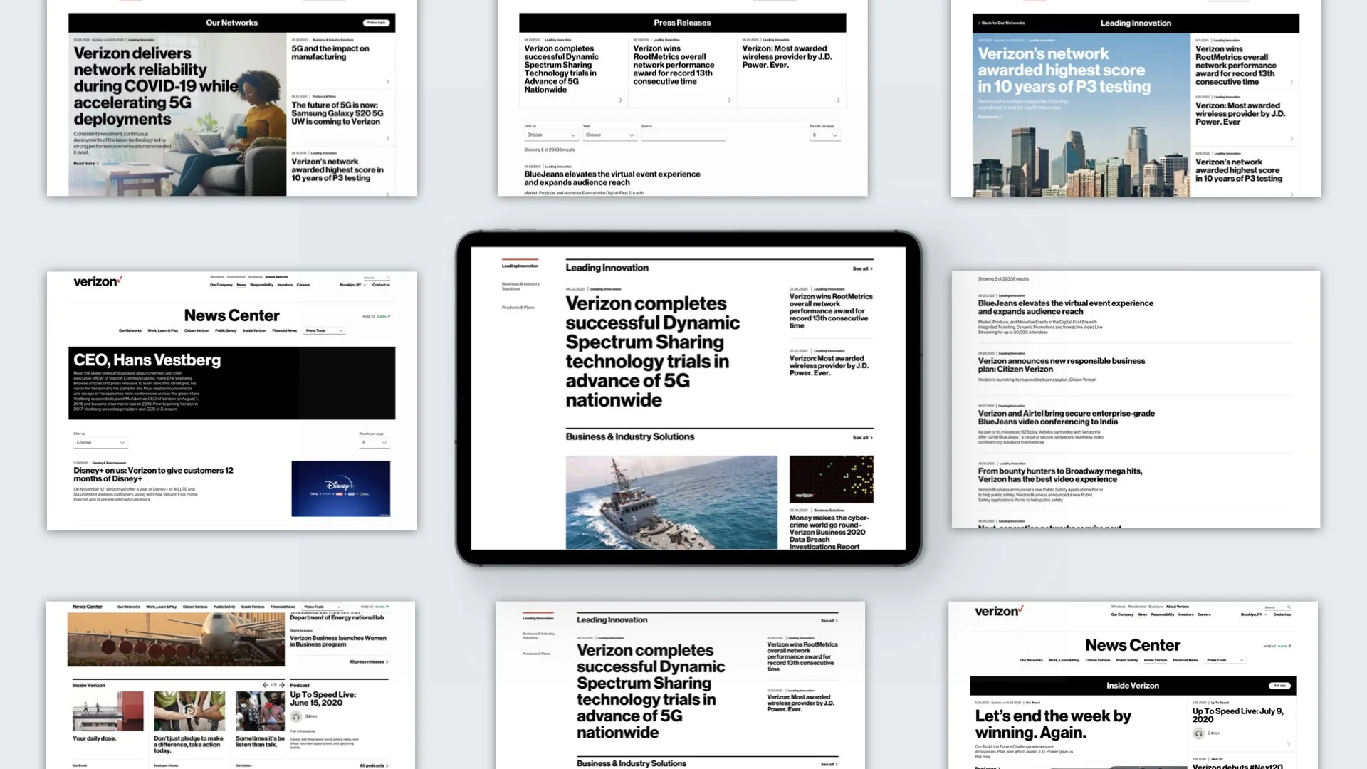
Content Strategy & Site Map
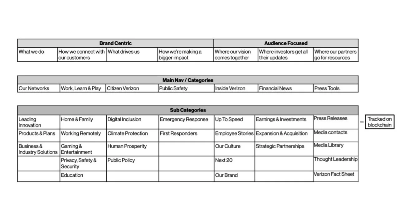
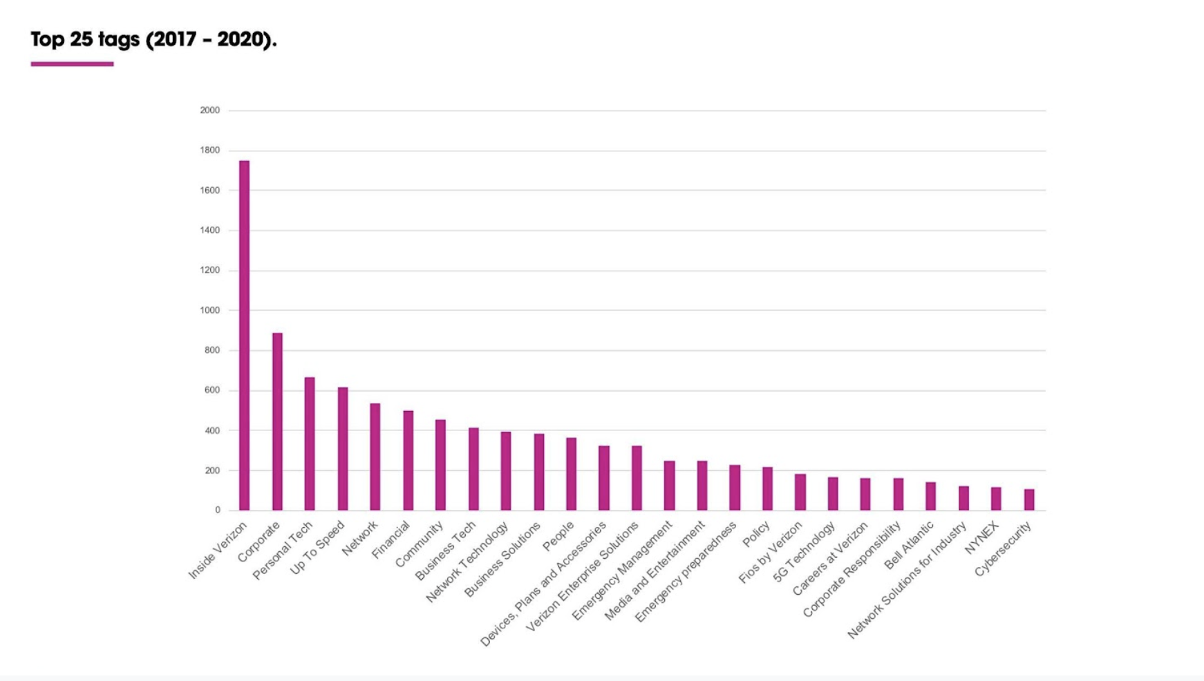
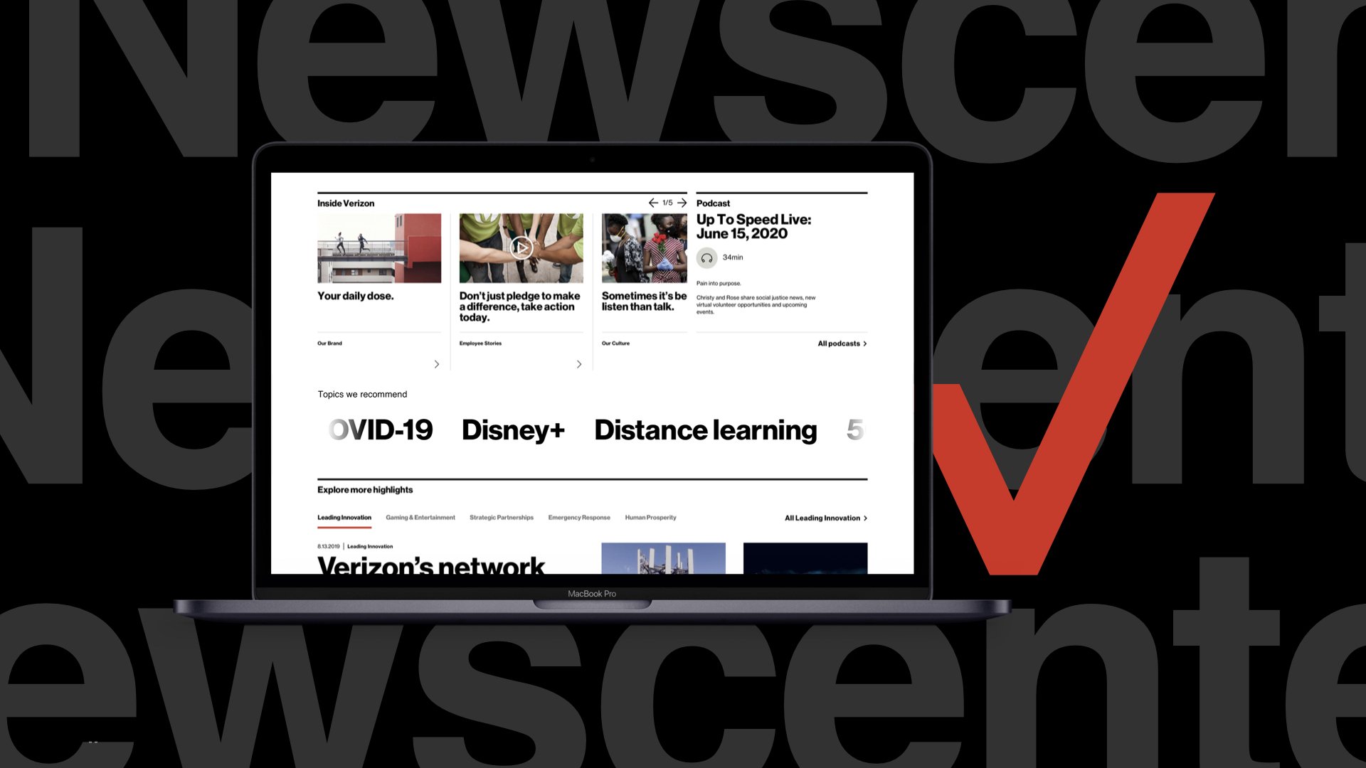
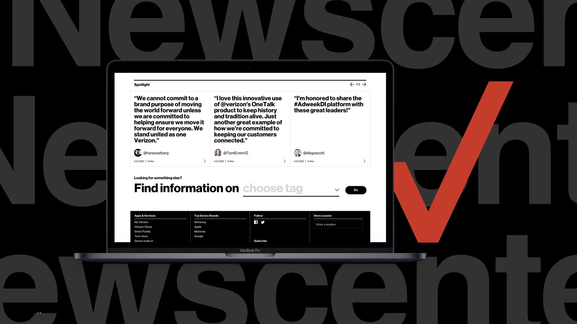
We evaluated the catalog of tags currently in use and audited existing content (800+ pieces released over two years) to create thematic groupings. And established two levels—categories and subcategories—that aligned with Verizon’s technology-forward narrative, publishing cadence, and editorial strategy. We also made it easier for users to look up specific content topics by implementing a new “tag search” feature.
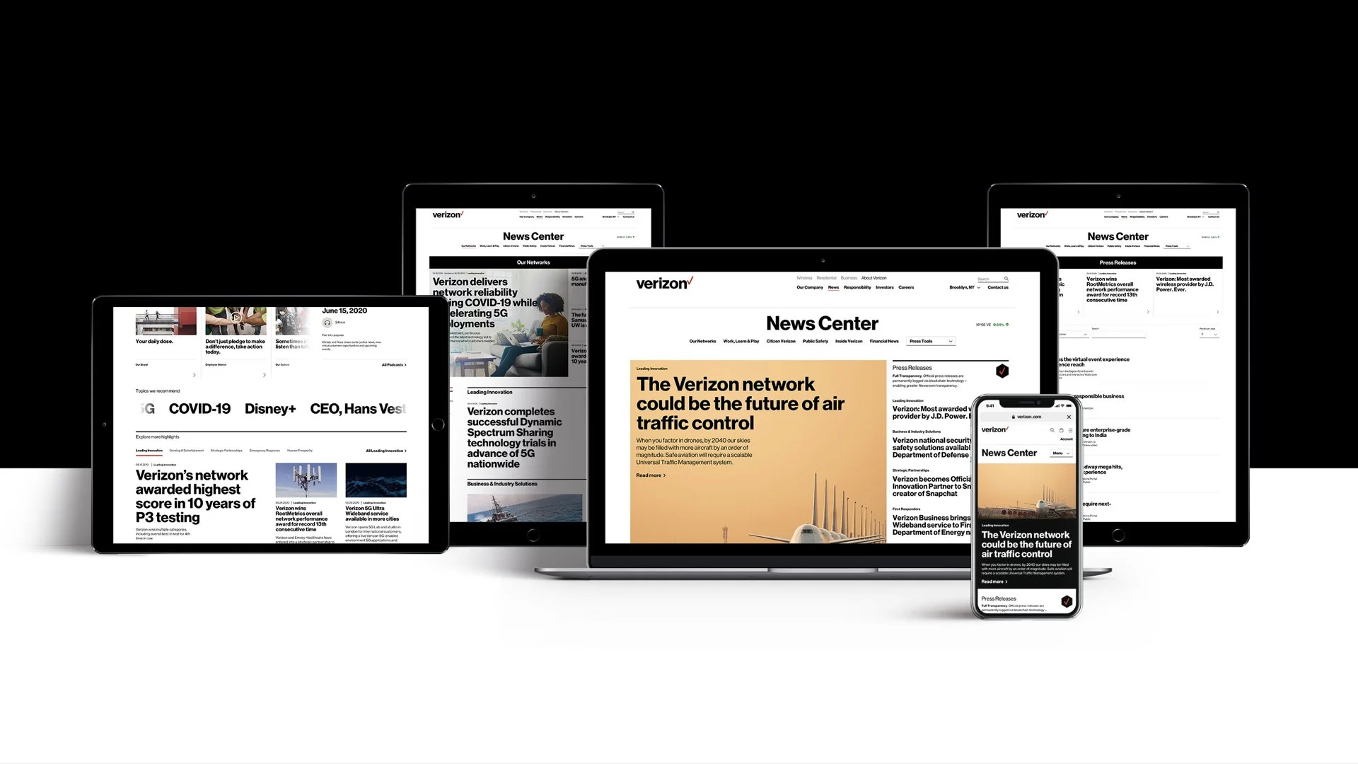
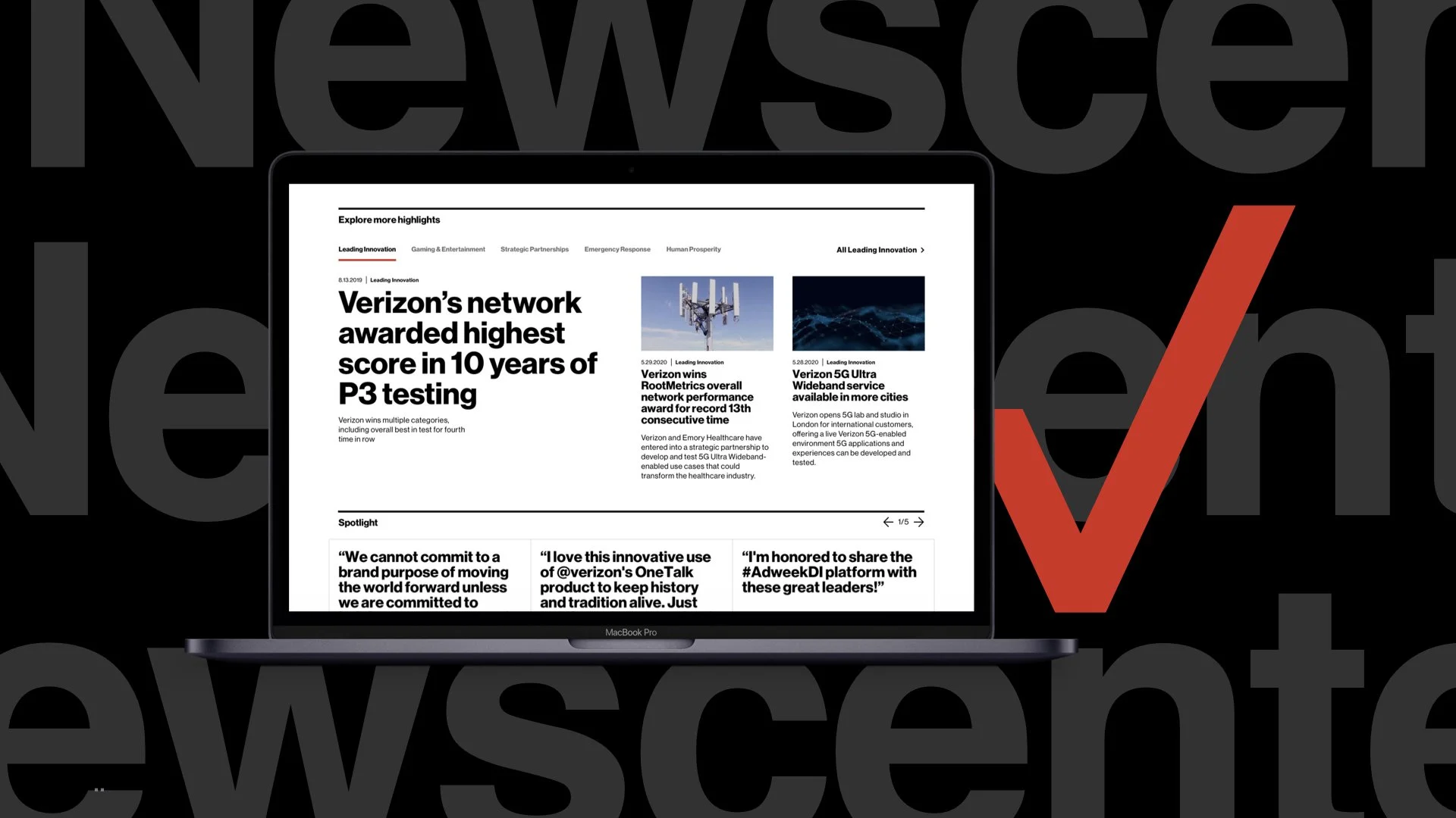
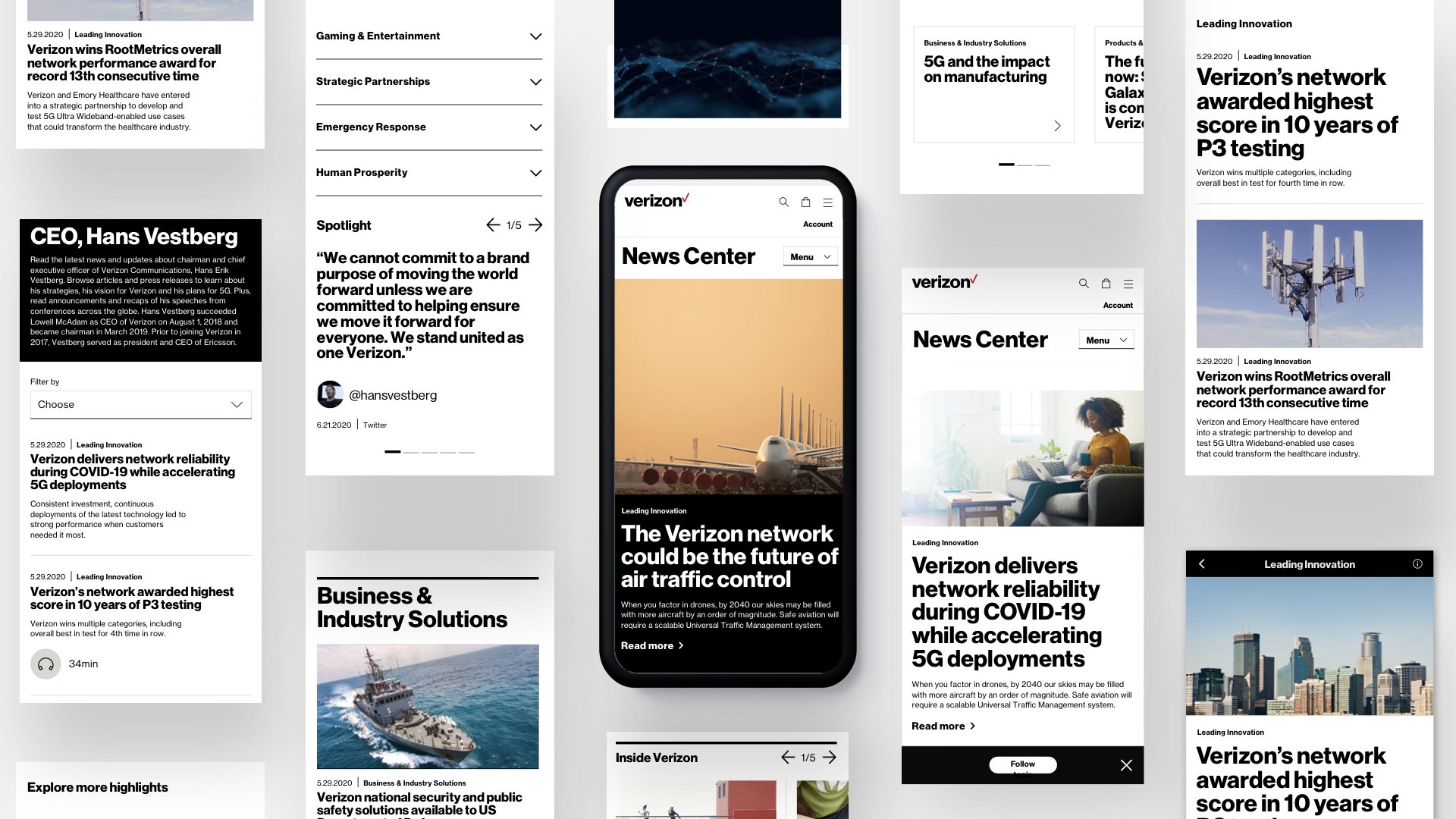
Homepage & Category Pages
Hierarchically, each page was given an “above the fold” A1 focal point, while a varied type scale and dividers helped establish a rhythm to draw the user’s eye down the page
Clear journeys for both high volume (employees, customers, job seekers) and high value (journalists, shareholders) stakeholders were created
70+ different states were accounted for and guidelines for responsive designs, image treatment, meta descriptions, text count, and more were created
A modular design system that allows the brand to dial-up select topics and content pieces was incorporated, enabling greater control over the narrative and serving different audience segments
Full Transparency Awards & Recognition
Fast Company, The One Show Awards, D&AD Awards, SABRE Awards, Gerety Awards, Andy’s Awards, and more.